DEEPLY relaxed – Branding project for Eva Hofbauer: Natural design for peace, healing and harmony
🌿 A piece of nature in design – the branding for Eva 🌿
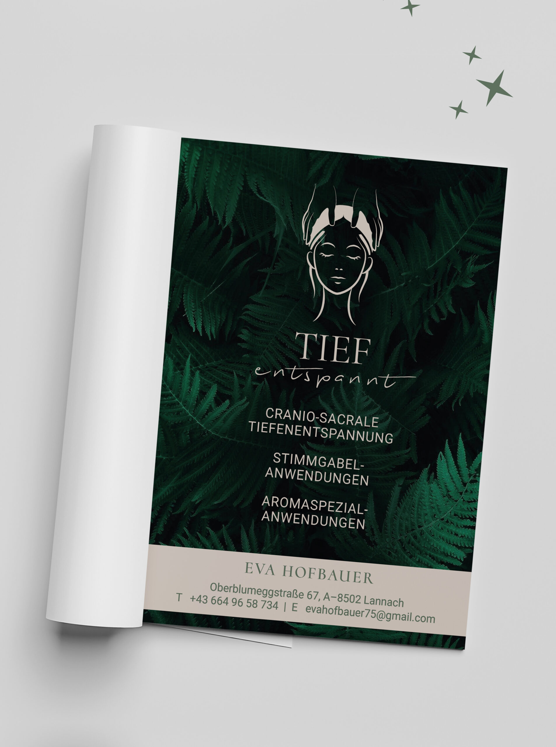
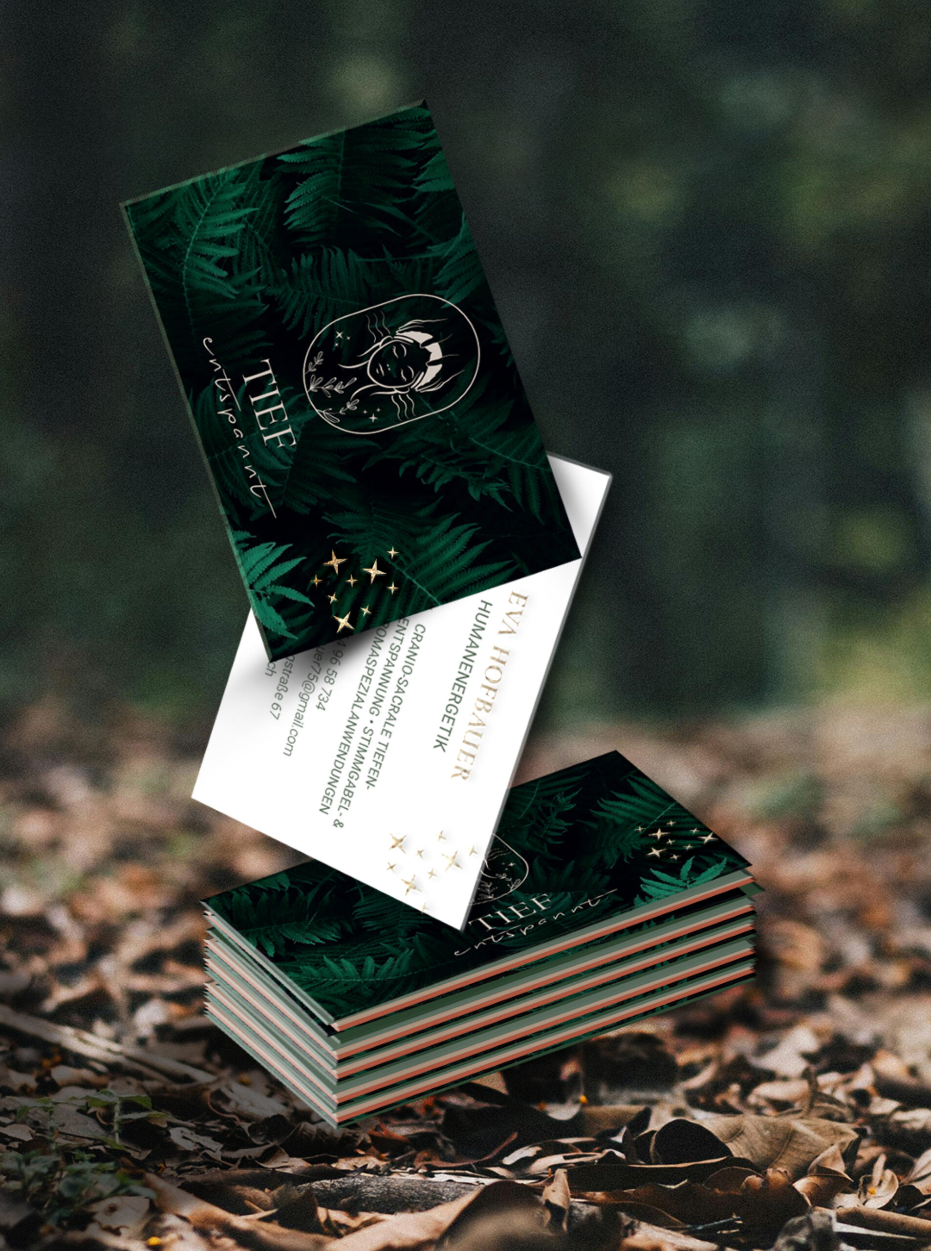
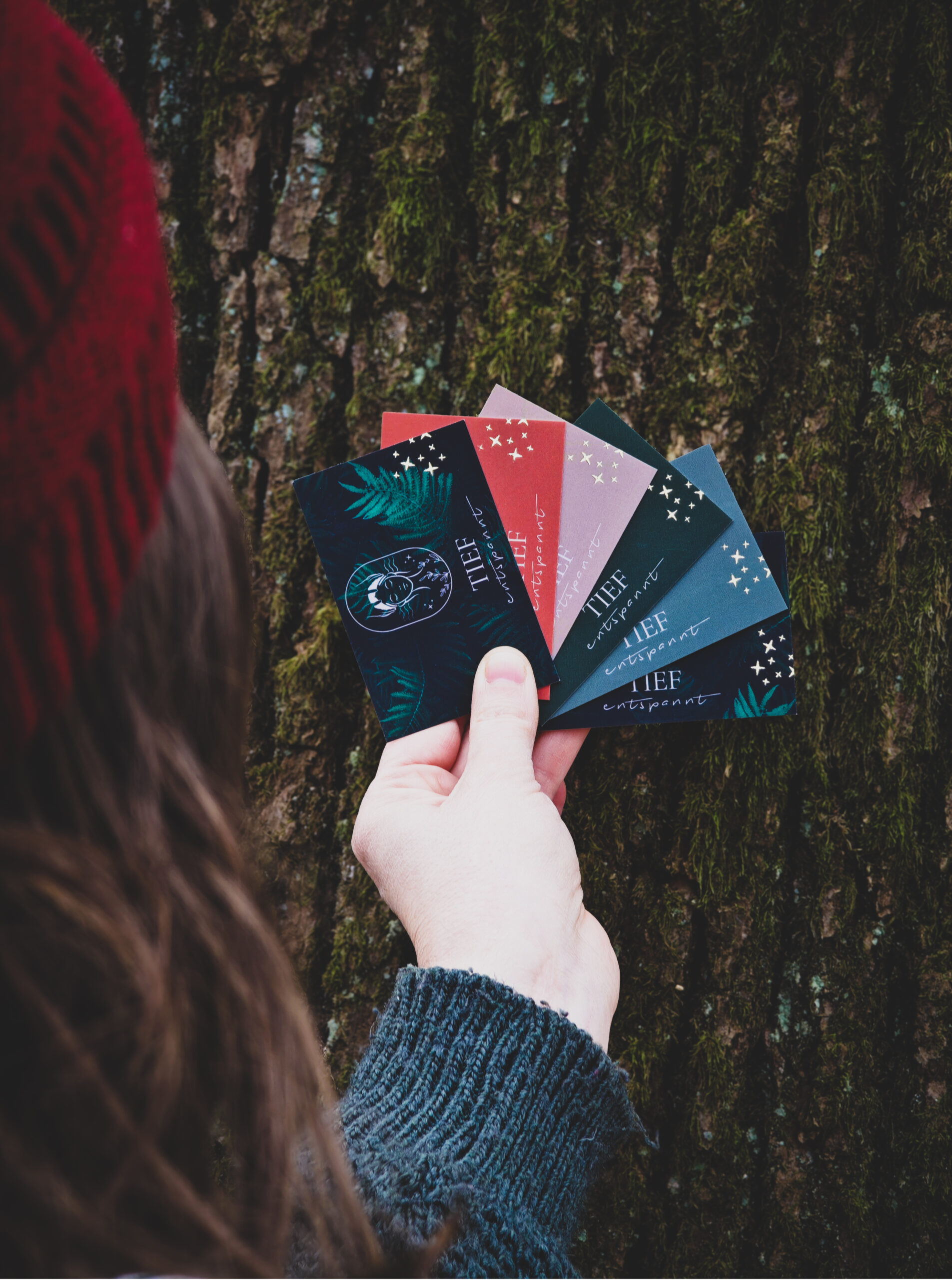
Some projects touch the soul from the very beginning - like the branding for Eva. With her work as a human energy therapist in cranio-sacral deep relaxation, tuning fork and aromatherapy, she creates moments of healing and harmony for body and mind.
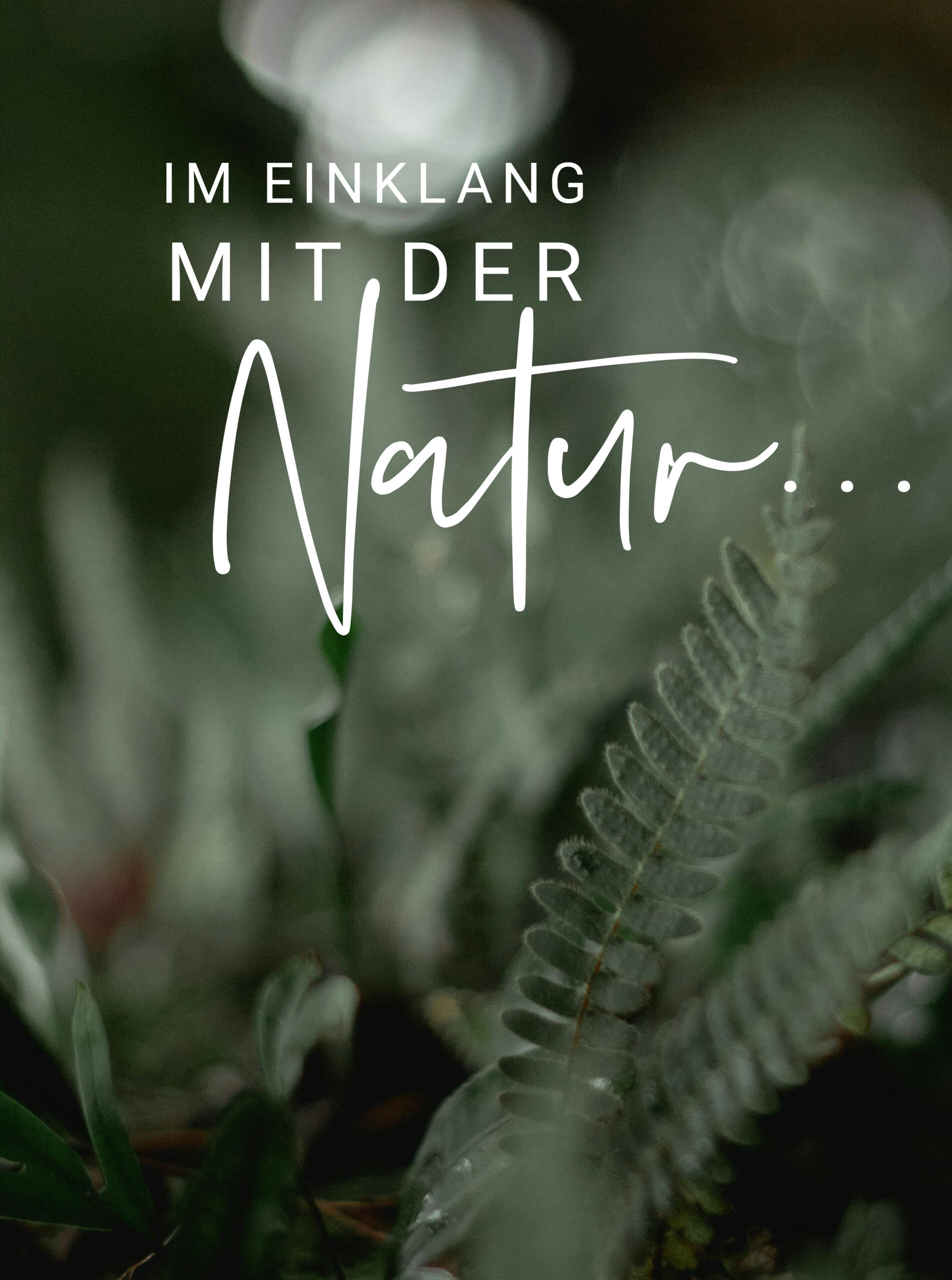
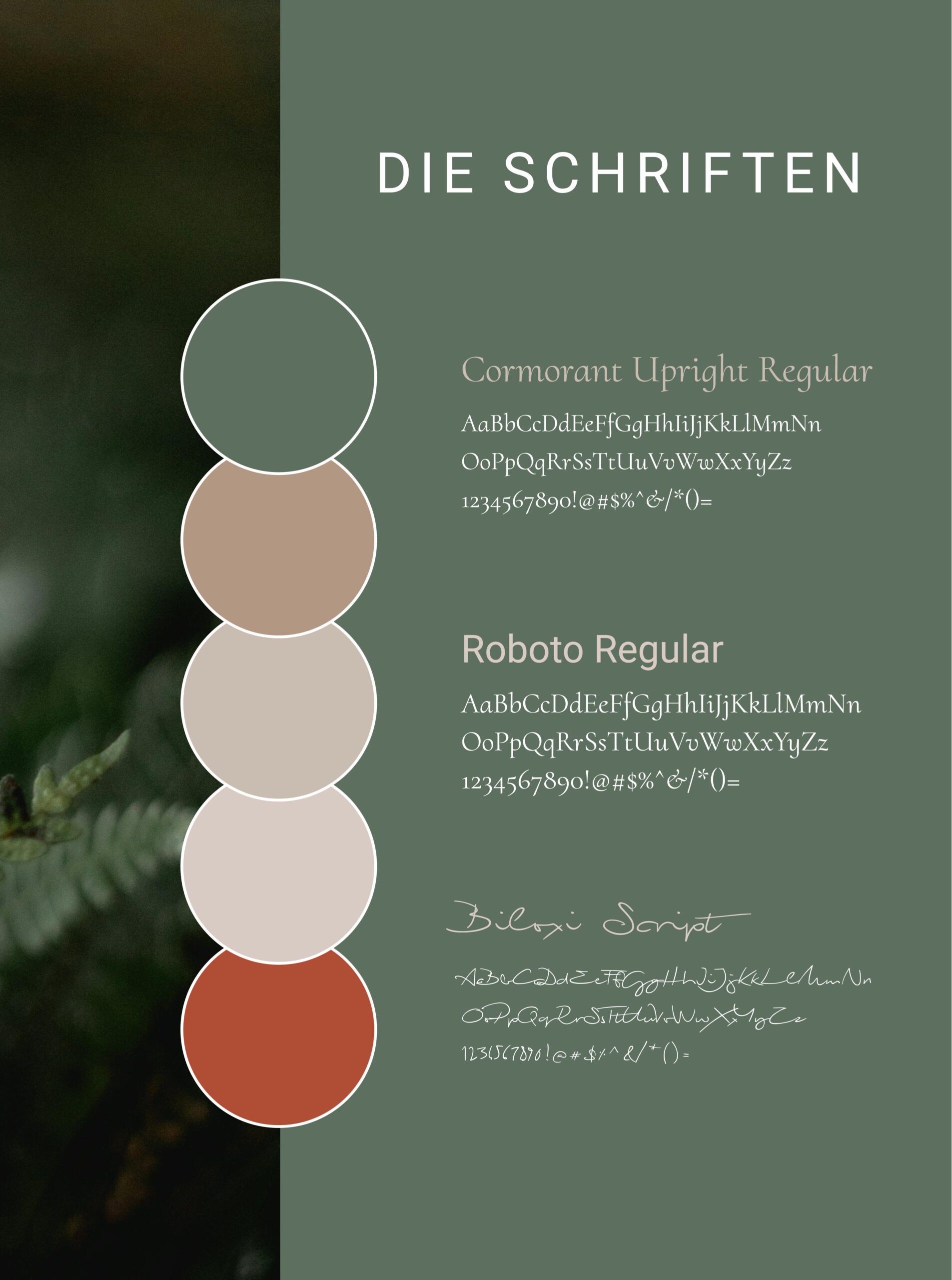
Eva's desire for an authentic, nature-oriented branding immediately inspired me. Soft green tones reminiscent of the forest and the rustling of ferns, as well as golden accents that radiate warmth and elegance, characterize her design.
🎨 The colors: The harmonious green tones represent balance, healing and relaxation - they reflect the power of nature, which plays a central role in Eva's work. The subtle gold tone symbolizes the appreciation and high standards she sets for her therapies.
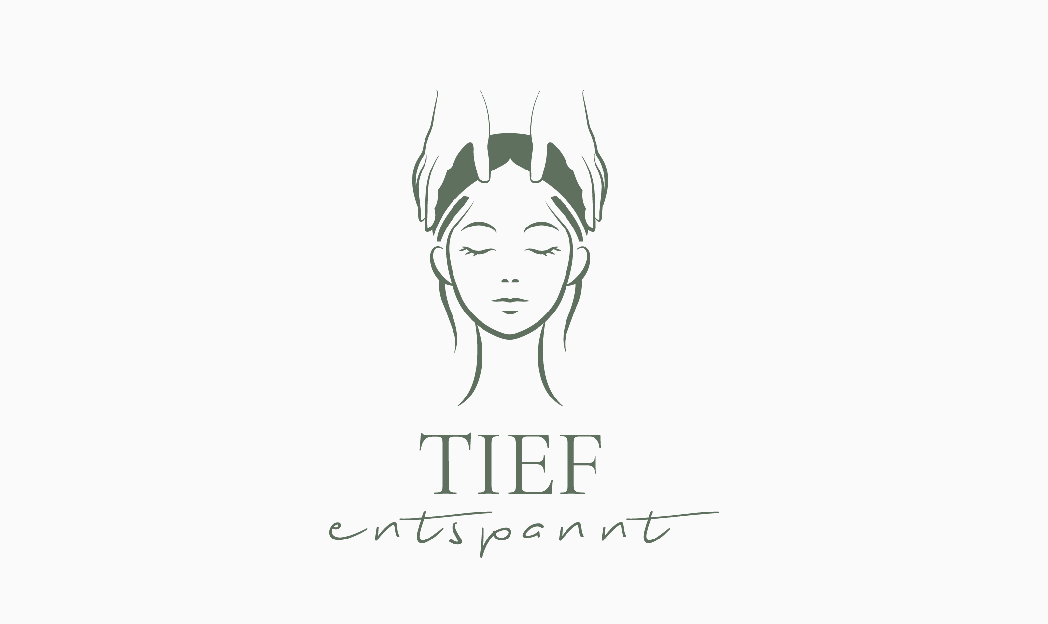
✨ The logo:Minimalistic but powerful, it combines Eva's deep understanding of body, mind and soul with her love of nature. The harmonious lines and motifs speak of calm, security and strength - values that her clients also experience in every session.
This branding is more than just a design – it is a visual promise of peace, healing and connection with nature. It was a special gift to be able to design these elements for Eva.
Services
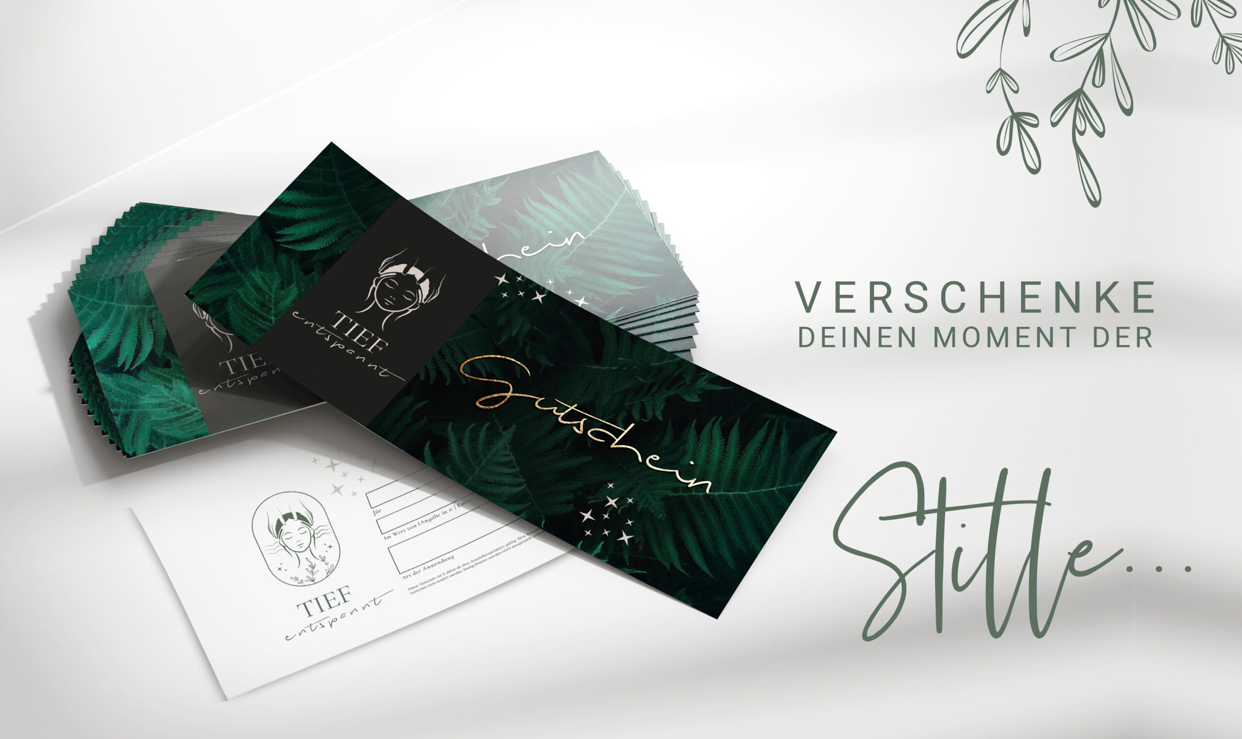
Branding, conception, logo design, color concept, brand guidelines, design of business stationery such as business cards, vouchers and advertisements.
Keywords
Branding for human energetics, emotional branding, nature-oriented design, logo design for wellness, color concept with green tones, corporate design with a reference to nature, craniosacral therapy branding, aromatherapy corporate identity, healing branding, logo design with harmony, authentic nature design, branding for feel-good therapies, personal branding with sensitivity.